
1. HTML中的元素类型及相互转换
1.1 块级元素特点(block-level)
常见的块元素有<h1>~<h6>、<p>、<div>、<ul>、<ol>、<li>等,其中<div>标签是最典型的块元素。(1)比较霸道,自己独占一行
(2)高度,宽度、外边距以及内边距都可以控制。
(3)宽度默认是容器(父级宽度)的100%
(4)是一个容器及盒子,里面可以放行内或者块级元素。
注意:
只有 文字才 能组成段落 因此 p 里面不能放块级元素,特别是 p 不能放div,否则会造成浏览器解析不正确,导致布局混乱。
同理还有这些标签h1,h2,h3,h4,h5,h6,dt,他们都是文字类块级标签,里面不能放其他块级元素。
实例代码
<!DOCTYPE html>
<html lang="en">
<head>
    <meta charset="UTF-8">
    <title>标准流</title>
    <style>
        div{
            background-color: red;
        }
        span{
            background-color: green;
        }
        input{
            background-color: blue;
        }
    </style>
</head>
<body>
    <div>我是div块级元素,独占一行,可以设置高宽</div>
    <div>我是div块级元素,独占一行,可以设置高宽</div>
    <span>我是span行内元素,可以并排显示,设置宽高无效,靠内容撑大</span>
    <span>我是span行内元素,可以并排显示,设置宽高无效,靠内容撑大</span>
    <input type="text" value="我是行内块元素,可以并排显示,且可以设置高宽,靠内容撑大">
    <input type="text" value="我是行内块元素,可以并排显示,且可以设置高宽,靠内容撑大">
</body>
</html>
效果图

1.2 行内元素特点(inline-level)
常见的行内元素有<a>、<strong>、<b>、<em>、<i>、<del>、<s>、<ins>、<u>、<span>等,其中<span>标签最典型的行内元素。有的地方也成内联元素(1)相邻行内元素在一行上,一行可以显示多个。
(2)直接设置高和宽是无效的。
(3)默认宽度就是它本身内容的宽度。
(4)行内元素只能容纳文本或则其他行内元素。
注意:
链接里面不能再放链接。
特殊情况a里面可以放块级元素,但是给a转换一下块级模式最安全。
实例代码
<!DOCTYPE html>
<html lang="en">
<head>
    <meta charset="UTF-8">
    <title>标准流</title>
    <style>
        div{
            background-color: red;
        }
        span{
            background-color: green;
        }
        input{
            background-color: blue;
        }
    </style>
</head>
<body>
    <div>我是div块级元素,独占一行,可以设置高宽</div>
    <div>我是div块级元素,独占一行,可以设置高宽</div>
    <span>我是span行内元素,可以并排显示,设置宽高无效,靠内容撑大</span>
    <span>我是span行内元素,可以并排显示,设置宽高无效,靠内容撑大</span>
    <input type="text" value="我是行内块元素,可以并排显示,且可以设置高宽,靠内容撑大">
    <input type="text" value="我是行内块元素,可以并排显示,且可以设置高宽,靠内容撑大">
</body>
</html>
效果图
1.3 行内块元素特点(inline-block)
在行内元素中有几个特殊的标签——<img />、<input />、<td>,可以对它们设置宽高和对齐属性,有些资料可能会称它们为行内块元素。(1)和相邻行内元素(行内块)在一行上,但是之间会有空白缝隙。一行可以显示多个 (2)默认宽度就是它本身内容的宽度。 (3)高度,行高、外边距以及内边距都可以控制。
实例代码
<!DOCTYPE html>
<html lang="en">
<head>
    <meta charset="UTF-8">
    <title>标准流</title>
    <style>
        div{
            background-color: red;
        }
        span{
            background-color: green;
        }
        input{
            background-color: blue;
        }
    </style>
</head>
<body>
    <div>我是div块级元素,独占一行,可以设置高宽</div>
    <div>我是div块级元素,独占一行,可以设置高宽</div>
    <span>我是span行内元素,可以并排显示,设置宽高无效,靠内容撑大</span>
    <span>我是span行内元素,可以并排显示,设置宽高无效,靠内容撑大</span>
    <input type="text" value="我是行内块元素,可以并排显示,且可以设置高宽,靠内容撑大">
    <input type="text" value="我是行内块元素,可以并排显示,且可以设置高宽,靠内容撑大">
</body>
</html>
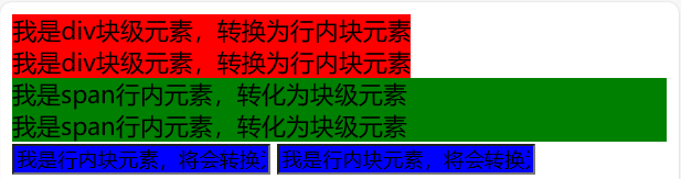
1.4 标签显示模式转换 display
块转行内:display:inline;
行内转块:display:block;
块、行内元素转换为行内块: display: inline-block;
1)三种模式总结区别
实例代码
<!DOCTYPE html>
<html lang="en">
<head>
    <meta charset="UTF-8">
    <title>标准流</title>
    <style>
        div{
            background-color: red;
            /*块级元素转换为行内块元素*/
            display: inline-block;
        }
        span{
            background-color: green;
            /*行内元素转转换为块级元素*/
            display: block;
        }
        input{
            background-color: blue;
            /*行内块元素转换为行内元素*/
            display: inline;
        }
    </style>
</head>
<body>
    <div>我是div块级元素,转换为行内块元素</div>
    <div>我是div块级元素,转换为行内块元素</div>
    <span>我是span行内元素,转化为块级元素</span>
    <span>我是span行内元素,转化为块级元素</span>
    <input type="text" value="我是行内块元素,转换为行内元素">
    <input type="text" value="我是行内块元素,转换为行内元素">
</body>
</html>
效果图

2. CSS的三种布局
2.1普通流(标准流)
块级元素会独占一行,从上向下顺序排列;
常用元素:div、hr、p、h1~h6、ul、ol、dl、form、table
行内元素/行内块会按照顺序,从左到右顺序排列,碰到父元素边缘则自动换行;
常用元素:span、a、i、em、img等
2.2 浮动
让盒子从普通流中浮起来,主要作用让多个块级盒子一行显示。
让多个盒子(div)水平排列成一行,使得浮动成为布局的重要手段。
可以实现盒子的左右对齐等等
浮动最早是用来控制图片,实现文字环绕图片的效果,所以如果单纯用来实现元素布局建议直接使用行内块元素来实现一样显示的布局。
2.2.1 语法
在 CSS 中,通过 float 中文浮动,属性定义浮动,语法如下:
选择器 { float: 属性值; }实例代码
<!DOCTYPE html>
<html lang="en">
<head>
    <meta charset="UTF-8">
    <title>浮动布局</title>
    <style>
        .d1{
            float:left;
        }
        div:nth-child(1){
            background-color: red;
        }
        div:nth-child(2){
            background-color: green;
        }
        .d2{
            float: right;
        }
        div:nth-child(3){
            background-color: blue;
        }
        div:nth-child(4){
            background-color: darkcyan;
        }
    </style>
</head>
<body>
    <div class="d1">我是div块级元素1</div>
    <div class="d1">我是div块级元素2</div>
    <div class="d2">我是div块级元素3</div>
    <div class="d2">我是div块级元素4</div>
</body>
</html>
效果图

2.2.2 注意事项
浮动元素不会占位置,会漂浮在标准流上边,但是可以通过为浮动元素添加父元素进行限制。
浮动元素不会影响前面的标准流,但因为浮动元素不占位置,所以会影响浮动后面的元素。
浮动 float 默认转换为类似行内块
所以如果单纯用来实现元素一行显示布局建议直接使用行内块元素来实现。
实例代码
<!DOCTYPE html>
<html lang="en">
<head>
<meta charset="UTF-8">
<title>浮动布局</title>
<style>
.sonBox{
float: left;
}
.sonBox:nth-child(1){
background-color: red;
}
.sonBox:nth-child(2){
background-color: blue;
}
.sonBox1{
background-color: green;
width: 200px;
}
</style>
</head>
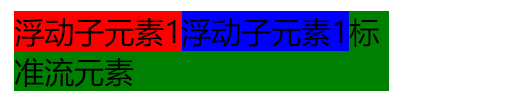
<body>
<div class="fatherBox">
<div class="sonBox">
浮动子元素1
</div>
<div class="sonBox">
浮动子元素1
</div>
<div class="sonBox1">
标准流元素
</div>
</div>
</body>
</html>效果图
2.2.3清除浮动
很多情况下我们需要使用子元素来自动撑大父元素盒子,所以就不能直接设置父元素的高度,而因为浮动的元素不占位置,所以浮动的 元素就不能撑大父元素盒子,如果父元素中的子元素全是浮动的元素,就会造成父元素的高度为0,从而造成布局混乱。为了解决这一 问题,就必须清除浮动,从而使父元素能检查到子元素的高度,从而自动调整自身的高度。
造成的父盒子高度为0的问题例子
<!DOCTYPE html>
<html lang="en">
<head>
    <meta charset="UTF-8">
    <title>浮动布局</title>
    <style>
        .sonBox{
            float: left;
        }
        .sonBox:nth-child(1){
            background-color: red;
        }
        .sonBox:nth-child(2){
            background-color: blue;
        }
        .sonBox1{
            background-color: green;
            width: 200px;
        }
    </style>
</head>
<body>
<div class="fatherBox">
    <div class="sonBox">
        浮动子元素1
    </div>
    <div class="sonBox">
        浮动子元素1
    </div>
    <div class="sonBox1">
        标准流元素
    </div>
</div>
</body>
</html>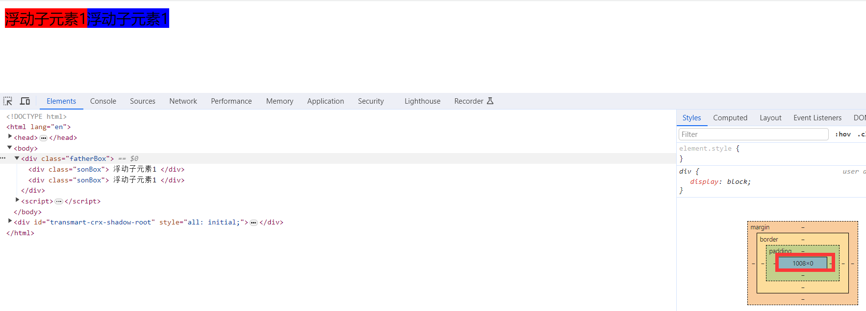
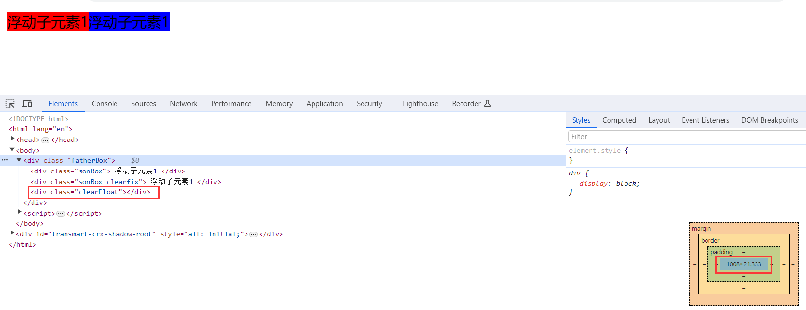
清除浮动的方法
在CSS中,clear属性用于清除浮动,在这里,我们先记住清除浮动的方法,具体的原理,等我们学完css会再回头分析。
语法:
选择器{clear:属性值;} clear 清除 1).标签清除法
但是我们实际工作中, 几乎只用 clear: both;
在浮动元素后面添加一个空标签,并使用清除浮动属性解决浮动引起的问题。
是W3C推荐的做法是通过在浮动元素末尾添加一个空的标签例如 <div style=”clear:both”></div>,或则其他标签br等亦可。优点: 通俗易懂,书写方便
缺点: 添加许多无意义的标签,结构化较差。
例子
<!DOCTYPE html>
<html lang="en">
<head>
    <meta charset="UTF-8">
    <title>浮动布局</title>
    <style>
        .sonBox{
            float: left;
        }
        .sonBox:nth-child(1){
            background-color: red;
        }
        .sonBox:nth-child(2){
            background-color: blue;
        }
        .clearFloat{
            clear: both;
        }
    </style>
</head>
<body>
<div class="fatherBox">
    <div class="sonBox">
        浮动子元素1
    </div>
    <div class="sonBox clearfix">
        浮动子元素1
    </div>
    <div class="clearFloat"></div>
</div>
</body>
</html>
效果图
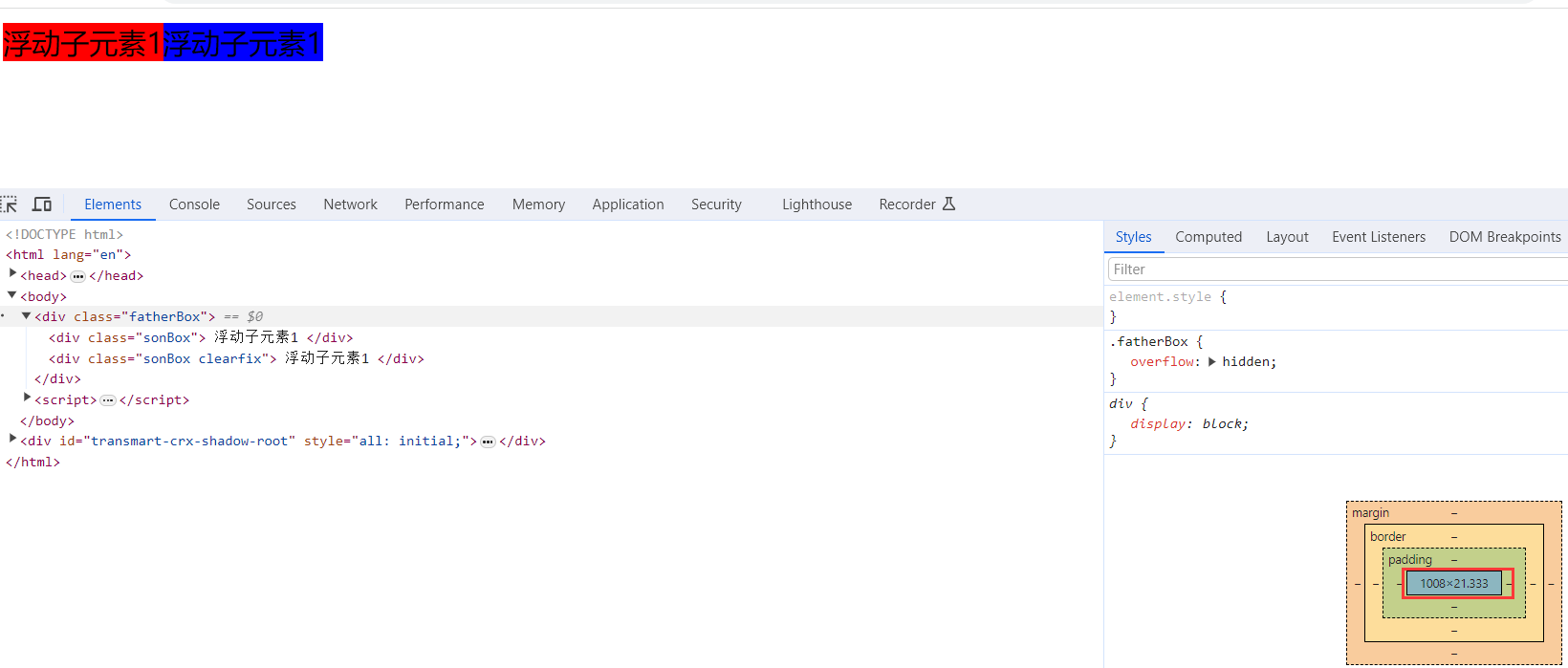
2).父级添加overflow属性方法
可以给父级添加: overflow为 hidden| auto| scroll 都可以实现。优点: 代码简洁
缺点: 内容增多时候容易造成不会自动换行导致内容被隐藏掉,无法显示需要溢出的元素。
例子:
<!DOCTYPE html>
<html lang="en">
<head>
    <meta charset="UTF-8">
    <title>浮动布局</title>
    <style>
        .fatherBox{
            overflow: hidden;
        }
        .sonBox{
            float: left;
        }
        .sonBox:nth-child(1){
            background-color: red;
        }
        .sonBox:nth-child(2){
            background-color: blue;
        }
    </style>
</head>
<body>
<div class="fatherBox">
    <div class="sonBox">
        浮动子元素1
    </div>
    <div class="sonBox clearfix">
        浮动子元素1
    </div>
</div>
</body>
</html>
效果图
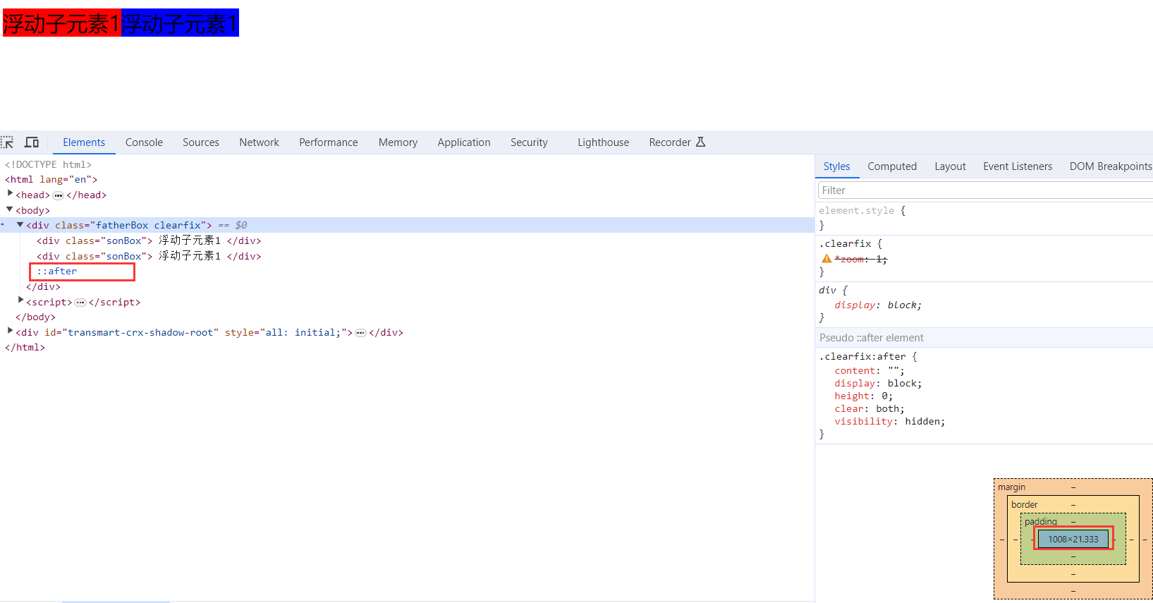
3).使用after伪元素清除浮动
:after 方式为空元素额外标签法的升级版,好处是不用单独加标签了
使用方法,在父盒子中后面添加伪元素标签专门用于解决浮动问题
 .clearfix:after {  content: ""; display: block; height: 0; clear: both; visibility: hidden;  }

 .clearfix {*zoom: 1;}   /* IE6、7 专有 */
优点: 符合闭合浮动思想 结构语义化正确
缺点: 由于IE6-7不支持:after,使用 zoom:1触发 hasLayout。
代表网站: 百度、淘宝网、网易等
例子:
<!DOCTYPE html>
<html lang="en">
<head>
    <meta charset="UTF-8">
    <title>浮动布局</title>
    <style>
        .clearfix:after {
            content: "";
            display: block;
            height: 0;
            clear: both;
            visibility: hidden;
        }
        .clearfix {
            /* IE6、7 专有 */
            *zoom: 1;
        }
        .sonBox{
            float: left;
        }
        .sonBox:nth-child(1){
            background-color: red;
        }
        .sonBox:nth-child(2){
            background-color: blue;
        }
    </style>
</head>
<body>
<div class="fatherBox clearfix">
    <div class="sonBox">
        浮动子元素1
    </div>
    <div class="sonBox">
        浮动子元素1
    </div>
</div>
</body>
</html>
效果图
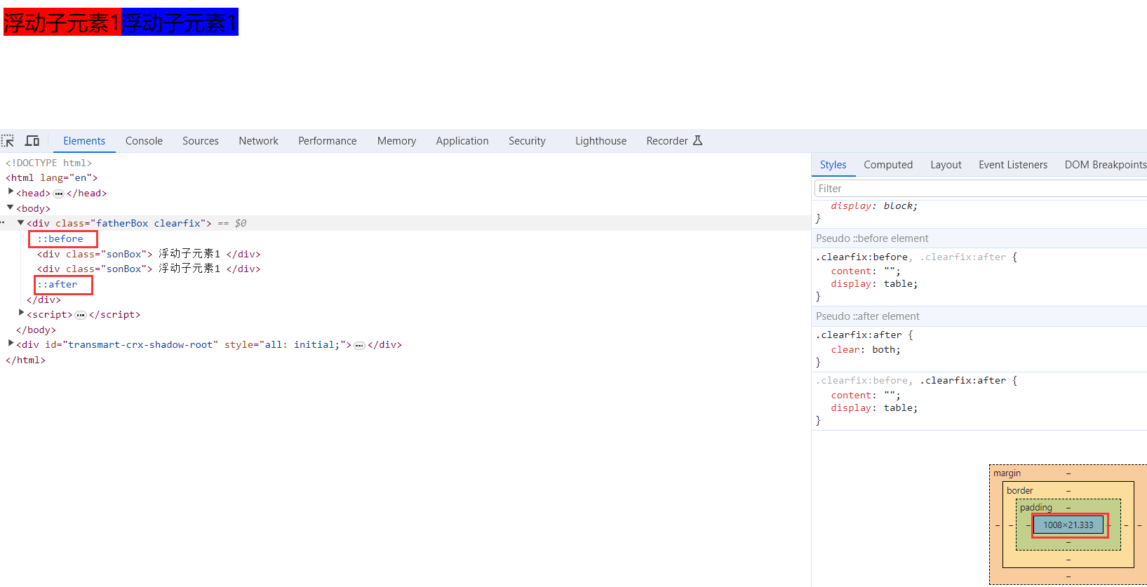
4).使用双伪元素清除浮动
使用方法,在父盒子中添加清除浮动的属性
.clearfix:before,.clearfix:after {
  content:"";
  display:table;
}
.clearfix:after {
 clear:both;
}
.clearfix {
  *zoom:1;
}
优点: 代码更简洁
缺点: 由于IE6-7不支持:after,使用 zoom:1触发 hasLayout。
代表网站: 小米、腾讯等
例子:
<!DOCTYPE html>
<html lang="en">
<head>
    <meta charset="UTF-8">
    <title>浮动布局</title>
    <style>
        .clearfix:before,.clearfix:after {
            content:"";
            display:table;
        }
        .clearfix:after {
            clear:both;
        }
        .clearfix {
            *zoom:1;
        }
        .sonBox{
            float: left;
        }
        .sonBox:nth-child(1){
            background-color: red;
        }
        .sonBox:nth-child(2){
            background-color: blue;
        }
    </style>
</head>
<body>
<div class="fatherBox clearfix">
    <div class="sonBox">
        浮动子元素1
    </div>
    <div class="sonBox">
        浮动子元素1
    </div>
</div>
</body>
</html>
效果图
5).四种清除方法区别
2.3 定位
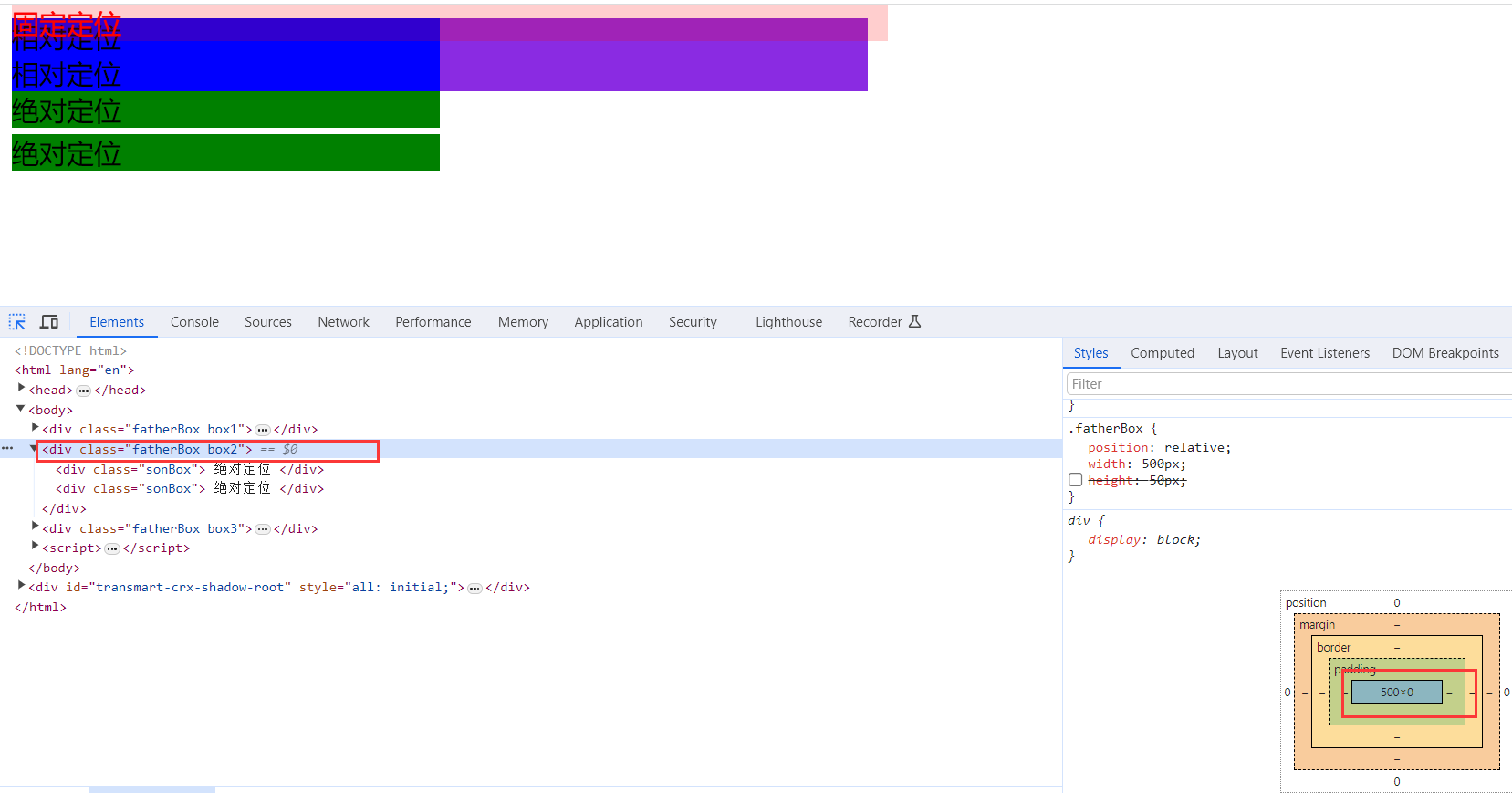
可以将盒子定在浏览器的某一个位置
可以将盒子水平居中、垂直居中、水平垂直居中
定位模式和偏移量都必须写
定位 = 定位模式 + 边偏移 2.3.1 定位模式
在 CSS 中,通过 position 属性定义元素的定位模式,语法如下:
选择器 { position: 属性值; }定位模式是有不同分类的,在不同情况下,我们用到不同的定位模式。
定位模式
边偏移
例子
<!DOCTYPE html>
<html lang="en">
<head>
    <meta charset="UTF-8">
    <title>定位</title>
    <style>
        .fatherBox{
            position: relative;
            width: 500px;
            /*height: 50px;*/
        }
        .fatherBox:nth-child(1){
            background-color: blueviolet;
        }
        .fatherBox:nth-child(2){
            background-color: antiquewhite;
        }
        .fatherBox:nth-child(3){
            background-color: gold;
        }
        .box1 .sonBox{
            position: relative;
            top:0px;
            width: 50%;
            background-color: blue;
        }
        .box2 .sonBox{
            position: absolute;
            width: 50%;
            background-color: green;
        }
        .box2 .sonBox:nth-child(1){
            top: 0px;
        }
        .box2 .sonBox:nth-child(2){
            top: 25px;
        }
        .box3 .sonBox{
            position: fixed;
            top: 0px;
            width: 50%;
            background-color: rgb(255,0,0,10%);
            color: red;
        }
    </style>
</head>
<body>
    <div class="fatherBox box1">
        <div class="sonBox">
            相对定位
        </div>
        <div class="sonBox">
            相对定位
        </div>
    </div>
    <div class="fatherBox box2">
        <div class="sonBox">
            绝对定位
        </div>
        <div class="sonBox">
            绝对定位
        </div>
    </div>
    <div class="fatherBox box3">
        <div class="sonBox">
            固定定位
        </div>
        <div class="sonBox">
            固定定位
        </div>
    </div>
</body>
</html>
效果
3. 流式布局
流式布局又称为百分比布局,不使用固定的像素布局,而是使用设置盒子的宽度百分比来根据屏幕宽度来进行伸缩
因为是采用宽度百分比形式布局,所以需要元素为块级元素或者行内块元素,并且百分比宽度是相对于父元素的宽度决定的。
例子:
<!DOCTYPE html>
<html lang="en">
<head>
    <meta charset="UTF-8">
    <title>浮动布局</title>
    <style>
        .fatherBox {
            width:100%;
            max-width:550px;
            min-width:320px;
            background-color: gold;
            overflow: hidden;
        }
        .fatherBox .sonBox{
            width:40%;
            float: left;
        }
        .sonBox:nth-child(1){
            background-color: red;
        }
        .sonBox:nth-child(2){
            background-color: blue;
        }
    </style>
</head>
<body>
<div class="fatherBox">
    <div class="sonBox">
        元素1
    </div>
    <div class="sonBox">
        元素2
    </div>
</div>
</body>
</html>
效果

4. flex布局
flex 是 flexible Box 的缩写,意为"弹性布局",用来为盒状模型提供最大的灵活性,任何一个容器都可以指定为 flex 布局。
当我们为父盒子设为 flex 布局以后,子元素的 float、clear 和 vertical-align 属性将失效。
总的来说,flex布局就是通过给父盒子添加flex属性,来控制子盒子的位置和排列方式.
4.1 flex使用流程
flex布局主要是通过为父盒子添加父元素特有的flex属性来控制子元素的排列方向和排列方式,通过为子盒子自己添加子元素特有的flex属性来控制自身的特别显示
4.2 父元素特有的flex属性
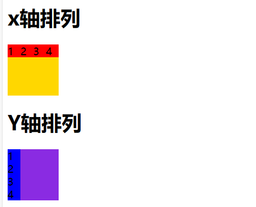
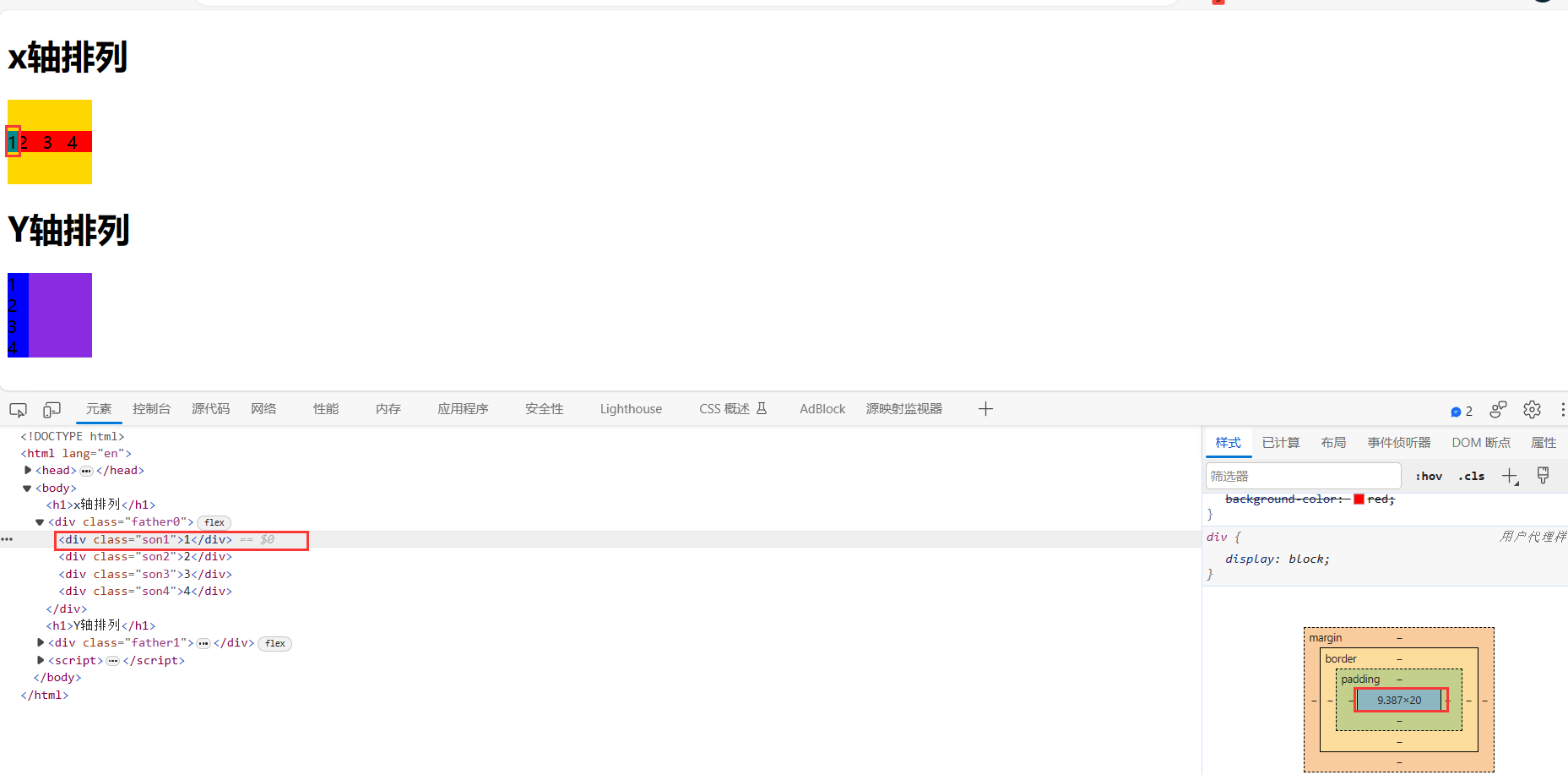
4.2.1.flex-direction设置主轴的方向
主轴有两个方向,行和列也叫x 轴和y 轴,设置了主轴后,另一个方向就会成为侧轴
例子
<!DOCTYPE html>
<html lang="en">
<head>
    <meta charset="UTF-8">
    <title>flex布局</title>
    <style>
        .father0{
            display: flex;
            /*设置主轴为x*/
            flex-direction: row;
            /*flex-direction: row-reverse;*/
            width: 80px;
            height: 80px;
            background-color: gold;
        }
        .father1{
            display: flex;
            /*设置主轴为y*/
            flex-direction: column;
            /*flex-direction: column-reverse;*/
            width: 80px;
            height: 80px;
            background-color: blueviolet;
        }
        .father0 div{
            width: 20px;
            height: 20px;
            background-color: red;
        }
        .father1 div{
            width: 20px;
            height: 20px;
            background-color: blue;
        }
    </style>
</head>
<body>
    <h1>x轴排列</h1>
    <div class="father0">
        <div class="son1">1</div>
        <div class="son2">2</div>
        <div class="son3">3</div>
        <div class="son4">4</div>
    </div>
    <h1>Y轴排列</h1>
    <div class="father1">
        <div class="son1">1</div>
        <div class="son2">2</div>
        <div class="son3">3</div>
        <div class="son4">4</div>
    </div>
</body>
</html>
效果
4.2.2.flex-wrap设置是否换行
默认情况下,项目都排在一条线(又称”轴线”)上。flex-wrap属性定义,flex布局中默认是不换行的。
代码如下
<!DOCTYPE html>
<html lang="en">
<head>
    <meta charset="UTF-8">
    <title>flex布局</title>
    <style>
        .father0{
            display: flex;
            /*设置主轴为x*/
            flex-direction: row;
            /*设置是否允许换行*/
            /*flex-wrap: nowrap;*/
            flex-wrap: wrap;
            width: 60px;
            height: 80px;
            background-color: gold;
        }
        .father1{
            display: flex;
            /*设置主轴为y*/
            flex-direction: column;
            /*flex-direction: column-reverse;*/
            width: 80px;
            height: 80px;
            background-color: blueviolet;
        }
        .father0 div{
            width: 20px;
            height: 20px;
            background-color: red;
        }
        .father1 div{
            width: 20px;
            height: 20px;
            background-color: blue;
        }
    </style>
</head>
<body>
    <h1>x轴排列</h1>
    <div class="father0">
        <div class="son1">1</div>
        <div class="son2">2</div>
        <div class="son3">3</div>
        <div class="son4">4</div>
    </div>
    <h1>Y轴排列</h1>
    <div class="father1">
        <div class="son1">1</div>
        <div class="son2">2</div>
        <div class="son3">3</div>
        <div class="son4">4</div>
    </div>
</body>
</html>
设置不允许换行:当主轴父盒子长度小于子元素总和时,子元素将会自动缩短。
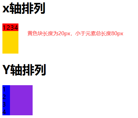
设置允许换行:当主轴父盒子长度小于子元素总和时,元素将自动换行到侧轴。
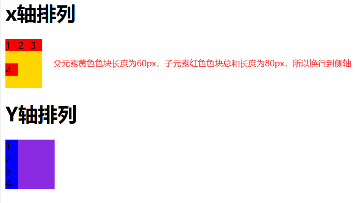
主轴方向和换行的复合写法
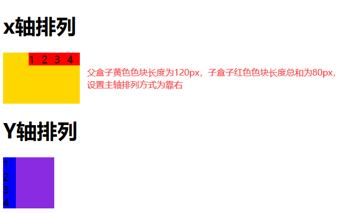
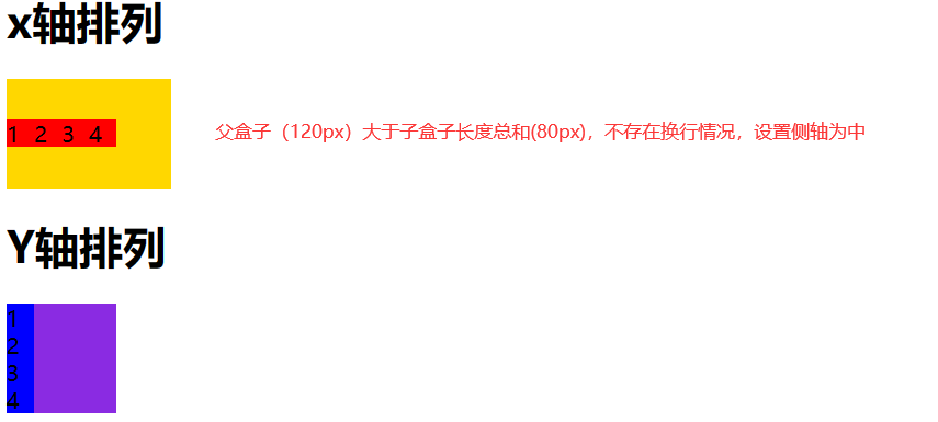
flex-flow:row wrap;4.2.3.justify-content 设置主轴上的子元素排列方式
当父盒子主轴长度大于子盒子长度总和时,可以使用justify-content来设置下列属性值,不写时默认属性值为flex-start
代码
<!DOCTYPE html>
<html lang="en">
<head>
    <meta charset="UTF-8">
    <title>flex布局</title>
    <style>
        .father0{
            display: flex;
            /*设置主轴为x*/
            flex-direction: row;
            /*设置是否允许换行*/
            /*flex-wrap: nowrap;*/
            flex-wrap: wrap;
            justify-content: right;
            width: 120px;
            height: 80px;
            background-color: gold;
        }
        .father1{
            display: flex;
            /*设置主轴为y*/
            flex-direction: column;
            /*flex-direction: column-reverse;*/
            width: 80px;
            height: 80px;
            background-color: blueviolet;
        }
        .father0 div{
            width: 20px;
            height: 20px;
            background-color: red;
        }
        .father1 div{
            width: 20px;
            height: 20px;
            background-color: blue;
        }
    </style>
</head>
<body>
    <h1>x轴排列</h1>
    <div class="father0">
        <div class="son1">1</div>
        <div class="son2">2</div>
        <div class="son3">3</div>
        <div class="son4">4</div>
    </div>
    <h1>Y轴排列</h1>
    <div class="father1">
        <div class="son1">1</div>
        <div class="son2">2</div>
        <div class="son3">3</div>
        <div class="son4">4</div>
    </div>
</body>
</html>
效果图
4.2.4.align-items 设置侧轴上的子元素排列方式(单行/单列 )
该属性是控制子项在侧轴上的排列方式 用于子项 未出现换行(单行)的时候使用
代码
<!DOCTYPE html>
<html lang="en">
<head>
    <meta charset="UTF-8">
    <title>flex布局</title>
    <style>
        .father0{
            display: flex;
            /*设置主轴为x*/
            flex-direction: row;
            /*设置侧轴(不存在换行)*/
            align-items: center;
            width: 120px;
            height: 80px;
            background-color: gold;
        }
        .father1{
            display: flex;
            /*设置主轴为y*/
            flex-direction: column;
            /*flex-direction: column-reverse;*/
            width: 80px;
            height: 80px;
            background-color: blueviolet;
        }
        .father0 div{
            width: 20px;
            height: 20px;
            background-color: red;
        }
        .father1 div{
            width: 20px;
            height: 20px;
            background-color: blue;
        }
    </style>
</head>
<body>
    <h1>x轴排列</h1>
    <div class="father0">
        <div class="son1">1</div>
        <div class="son2">2</div>
        <div class="son3">3</div>
        <div class="son4">4</div>
    </div>
    <h1>Y轴排列</h1>
    <div class="father1">
        <div class="son1">1</div>
        <div class="son2">2</div>
        <div class="son3">3</div>
        <div class="son4">4</div>
    </div>
</body>
</html>
效果
4.2.5.align-content 设置侧轴上的子元素的排列方式(多行/多列)
设置子项在侧轴上的排列方式 并且只能 用于子项 出现换行 的情况(多行/多列),禁止在单行下使用。
代码
<!DOCTYPE html>
<html lang="en">
<head>
    <meta charset="UTF-8">
    <title>flex布局</title>
    <style>
        .father0{
            display: flex;
            /*设置主轴为x*/
            flex-direction: row;
            /*设置侧轴(出现换行)*/
            align-content: center;
            width: 60px;
            /*设置允许换行*/
            flex-wrap: wrap;
            height: 80px;
            background-color: gold;
        }
        .father1{
            display: flex;
            /*设置主轴为y*/
            flex-direction: column;
            /*flex-direction: column-reverse;*/
            width: 80px;
            height: 80px;
            background-color: blueviolet;
        }
        .father0 div{
            width: 20px;
            height: 20px;
            background-color: red;
        }
        .father1 div{
            width: 20px;
            height: 20px;
            background-color: blue;
        }
    </style>
</head>
<body>
    <h1>x轴排列</h1>
    <div class="father0">
        <div class="son1">1</div>
        <div class="son2">2</div>
        <div class="son3">3</div>
        <div class="son4">4</div>
    </div>
    <h1>Y轴排列</h1>
    <div class="father1">
        <div class="son1">1</div>
        <div class="son2">2</div>
        <div class="son3">3</div>
        <div class="son4">4</div>
    </div>
</body>
</html>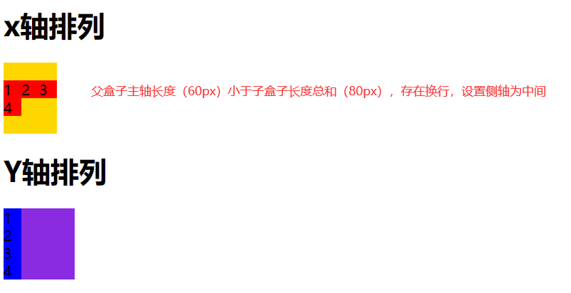
4.3 子元素特有的flex属性
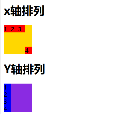
4.3.1.flex 属性
flex 属性定义子项目分配剩余空间,用flex来表示占多少份数。
一份的长度=(父盒子主轴总长度-份数为0元素的最小长度)/总份数
.item {
    flex: <number>; /* 默认值 0 */
}
例子
<!DOCTYPE html>
<html lang="en">
<head>
    <meta charset="UTF-8">
    <title>flex布局</title>
    <style>
        .father0{
            display: flex;
            /*设置主轴为x*/
            flex-direction: row;
            width: 80px;
            /*设置允许换行*/
            flex-wrap: wrap;
            height: 80px;
            background-color: gold;
        }
        .father1{
            display: flex;
            /*设置主轴为y*/
            flex-direction: column;
            /*flex-direction: column-reverse;*/
            width: 80px;
            height: 80px;
            background-color: blueviolet;
        }
        .father0 div{
            width: 20px;
            height: 20px;
            background-color: red;
        }
        .father0 div:nth-child(1){
            /*设置份数为0*/
            flex: 0;
            background-color: darkcyan;
        }
        .father0 div:nth-child(2){
            flex: 1;
        }
        .father0 div:nth-child(3){
            flex: 1;
        }
        .father0 div:nth-child(4){
            flex: 1;
        }
        .father1 div{
            width: 20px;
            height: 20px;
            background-color: blue;
        }
    </style>
</head>
<body>
    <h1>x轴排列</h1>
    <div class="father0">
        <div class="son1">1</div>
        <div class="son2">2</div>
        <div class="son3">3</div>
        <div class="son4">4</div>
    </div>
    <h1>Y轴排列</h1>
    <div class="father1">
        <div class="son1">1</div>
        <div class="son2">2</div>
        <div class="son3">3</div>
        <div class="son4">4</div>
    </div>
</body>
</html>
效果
4.3.2.align-self属性
控制子项自己在侧轴上的排列方式
align-self 属性允许单个项目有与其他项目不一样的对齐方式,可覆盖 align-items 属性。
默认值为 auto,表示继承父元素的 align-items 属性,如果没有父元素,则等同于 stretch。
span:nth-child(2) {
      /* 设置自己在侧轴上的排列方式 */
      align-self: flex-end;
}
例子
<!DOCTYPE html>
<html lang="en">
<head>
    <meta charset="UTF-8">
    <title>flex布局</title>
    <style>
        .father0{
            display: flex;
            /*设置主轴为x*/
            flex-direction: row;
            width: 80px;
            /*设置允许换行*/
            flex-wrap: wrap;
            height: 80px;
            background-color: gold;
        }
        .father1{
            display: flex;
            /*设置主轴为y*/
            flex-direction: column;
            /*flex-direction: column-reverse;*/
            width: 80px;
            height: 80px;
            background-color: blueviolet;
        }
        .father0 div{
            width: 20px;
            height: 20px;
            background-color: red;
        }
        .father0 div:nth-child(4){
            align-self: flex-end;
        }
        .father1 div{
            width: 20px;
            height: 20px;
            background-color: blue;
        }
    </style>
</head>
<body>
    <h1>x轴排列</h1>
    <div class="father0">
        <div class="son1">1</div>
        <div class="son2">2</div>
        <div class="son3">3</div>
        <div class="son4">4</div>
    </div>
    <h1>Y轴排列</h1>
    <div class="father1">
        <div class="son1">1</div>
        <div class="son2">2</div>
        <div class="son3">3</div>
        <div class="son4">4</div>
    </div>
</body>
</html>
效果
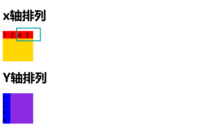
4.3.3.order 属性
定义项目的排列顺序
数值越小,排列越靠前,默认为0。
注意:和 z-index 不一样。
.item {
    order: <number>;
}
例子
<!DOCTYPE html>
<html lang="en">
<head>
    <meta charset="UTF-8">
    <title>flex布局</title>
    <style>
        .father0{
            display: flex;
            /*设置主轴为x*/
            flex-direction: row;
            width: 80px;
            /*设置允许换行*/
            flex-wrap: wrap;
            height: 80px;
            background-color: gold;
        }
        .father1{
            display: flex;
            /*设置主轴为y*/
            flex-direction: column;
            /*flex-direction: column-reverse;*/
            width: 80px;
            height: 80px;
            background-color: blueviolet;
        }
        .father0 div{
            width: 20px;
            height: 20px;
            background-color: red;
        }
        .father0 div:nth-child(3){
            /*调整排序顺序*/
            order: 1;
        }
        .father0 div:nth-child(4){
            /*调整排序顺序*/
           order: 0;
        }
        .father1 div{
            width: 20px;
            height: 20px;
            background-color: blue;
        }
    </style>
</head>
<body>
    <h1>x轴排列</h1>
    <div class="father0">
        <div class="son1">1</div>
        <div class="son2">2</div>
        <div class="son3">3</div>
        <div class="son4">4</div>
    </div>
    <h1>Y轴排列</h1>
    <div class="father1">
        <div class="son1">1</div>
        <div class="son2">2</div>
        <div class="son3">3</div>
        <div class="son4">4</div>
    </div>
</body>
</html>
效果
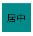
5. 水平垂直居中
5.1 文字水平垂直居中
<!DOCTYPE html>
<html lang="en">
<head>
    <meta charset="UTF-8">
    <title>居中</title>
    <style>
        div{
            width: 50px;
            height: 50px;
            /*水平居中*/
            text-align: center;
            /*行高等于高,垂直居中*/
            line-height: 50px;
            background-color: darkcyan;
        }
    </style>
</head>
<body>
  <div>
      居中
  </div>
</body>
</html>
效果
5.2 文字和行内块元素水平居中
<!DOCTYPE html>
<html lang="en">
<head>
    <meta charset="UTF-8">
    <title>居中</title>
    <style>
        .fatherBox{
            width: 80px;
            height: 50px;
             /*水平居中*/
            text-align: center;
             /*行高等于高,垂直居中*/
            line-height: 80px;
            background-color: darkcyan;
        }
        .sonBox{
            height: 25px;
            width: 25px;
            display: inline-block;
            /*基线垂直居中*/
            vertical-align: middle;
            background-color: blue;
        }
    </style>
</head>
<body>
  <div class="fatherBox">
      <div class="sonBox"></div>居中
  </div>
</body>
</html>
效果
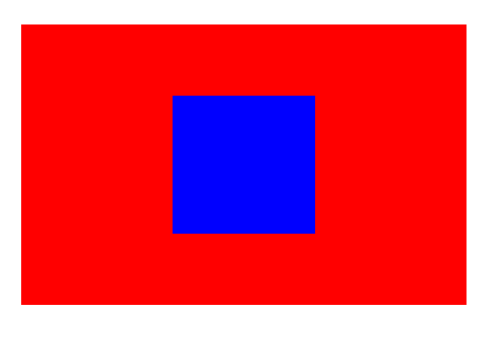
5.3 position定位实现居中
<!DOCTYPE html>
<html lang="en">
<head>
    <meta charset="UTF-8">
    <title>居中</title>
    <style>
        .fatherBox{
            height: 50px;
            width: 80px;
            position: relative;
            background-color: red;
        }
        .sonBox{
            height: 25px;
            width: 25px;
            display: inline-block;
            position: absolute;
            top: 50%;
            left: 50%;
            transform: translateX(-50%) translateY(-50%);
            background-color: blue;
            vertical-align: middle;
        }
    </style>
</head>
<body>
  <div class="fatherBox">
      <div class="sonBox"></div>
  </div>
</body>
</html>
效果
5.4 flex弹性实现居中
1)直接使用flex原生实现
<!DOCTYPE html>
<html lang="en">
<head>
    <meta charset="UTF-8">
    <title>居中</title>
    <style>
        .fatherBox{
            height: 50px;
            width: 80px;
            display: flex;
            flex-direction: column;
            justify-content: center;
            align-items: center;
            background-color: red;
        }
        .sonBox{
            height: 25px;
            width: 25px;
            background-color: blue;
        }
    </style>
</head>
<body>
  <div class="fatherBox">
      <div class="sonBox"></div>
  </div>
</body>
</html>
效果
2)flex+margin实现水平垂直居中
<!DOCTYPE html>
<html lang="en">
<head>
    <meta charset="UTF-8">
    <title>居中</title>
    <style>
        .fatherBox{
            height: 50px;
            width: 80px;
            display: flex;
            background-color: red;
        }
        .sonBox{
            height: 25px;
            width: 25px;
            background-color: blue;
            margin: auto;
        }
    </style>
</head>
<body>
  <div class="fatherBox">
      <div class="sonBox"></div>
  </div>
</body>
</html>
效果
6. 响应式布局
6.1 媒体查询
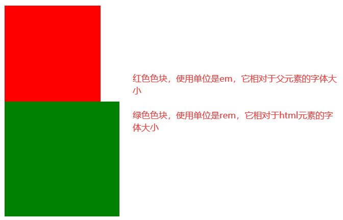
1)单位
响应式布局的单位em和rem
em是相对与父元素标签的字体大小为单位,做响应式布局
rem是相当于html标签的字体大小为单位,做响应式布局
计算公式:元素长度=父元素标签或者html字体大小*em或者rem的份数
例子
<!DOCTYPE html>
<html lang="en">
<head>
    <meta charset="UTF-8">
    <title>媒体查询响应式</title>
    <style>
        html{
            font-size: 12px;
        }
        body{
            font-size: 10px;
        }
        .fBox1{
            width: 10em; /*相当于100px*/
            height: 10em;
            background-color: red;
        }
        .fBox2{
            width: 10rem; /*相当于120px*/
            height: 10rem;
            background-color: green;
        }
    </style>
</head>
<body>
    <div class="fBox1"></div>
    <div class="fBox2"></div>
</body>
</html>
效果
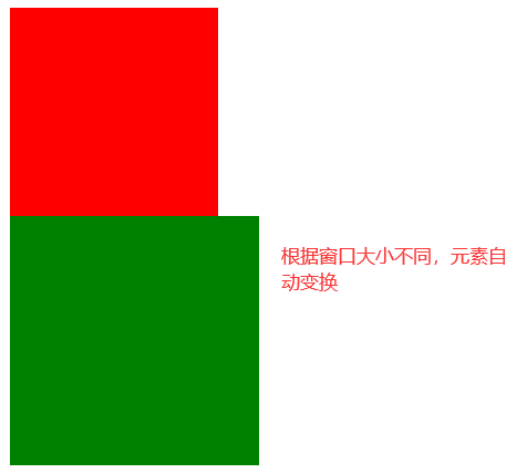
2)使用@media来动态更改html或者父元素的字体大小
<!DOCTYPE html>
<html lang="en">
<head>
    <meta charset="UTF-8">
    <title>媒体查询响应式</title>
    <style>
        /**
            媒体查询
            screen表示查询当前屏幕
            max-width表示小于800px时执行
        */
        @media screen and (max-width:800px) {
            html{
                font-size: 12px;
            }
            body{
                font-size: 10px;
            }
        }
        @media screen and (max-width:500px) {
            html{
                font-size: 10px;
            }
            body{
                font-size: 8px;
            }
        }
        .fBox1{
            width: 10em;
            height: 10em;
            background-color: red;
        }
        .fBox2{
            width: 10rem;
            height: 10rem;
            background-color: green;
        }
    </style>
</head>
<body>
    <div class="fBox1"></div>
    <div class="fBox2"></div>
</body>
</html>
效果
3).使用媒体查询来动态引入不同的样式文件
<!DOCTYPE html>
<html lang="en">
<head>
    <meta charset="UTF-8">
    <title>媒体查询响应式</title>
    /**
    媒体查询
    screen表示查询当前屏幕
    max-width表示小于800px时执行
    */
    <link rel="stylesheet" href="适配方案1.css" media="screen and (max-width:800px) ">
    <link rel="stylesheet" href="适配方案2.css" media="screen and (max-width:500px) ">
    <style>
        .fBox1{
            width: 10em;
            height: 10em;
            background-color: red;
        }
        .fBox2{
            width: 10rem;
            height: 10rem;
            background-color: green;
        }
    </style>
</head>
<body>
    <div class="fBox1"></div>
    <div class="fBox2"></div>
</body>
</html>
3).less计算
less可以帮助我们计算出具体的rem值,从而避免手动计算。
less可以实现css选择器嵌套,从而更方便的阅读。
6.2 bootstrap框架实现响应式
1).栅格系统
类似于flex中的份数布局,当子元素总长度大于父元素主轴长度时会自动调节一样1,不同的是bootstrap将每一行都拆分成了12份,根据份数来确定大小。